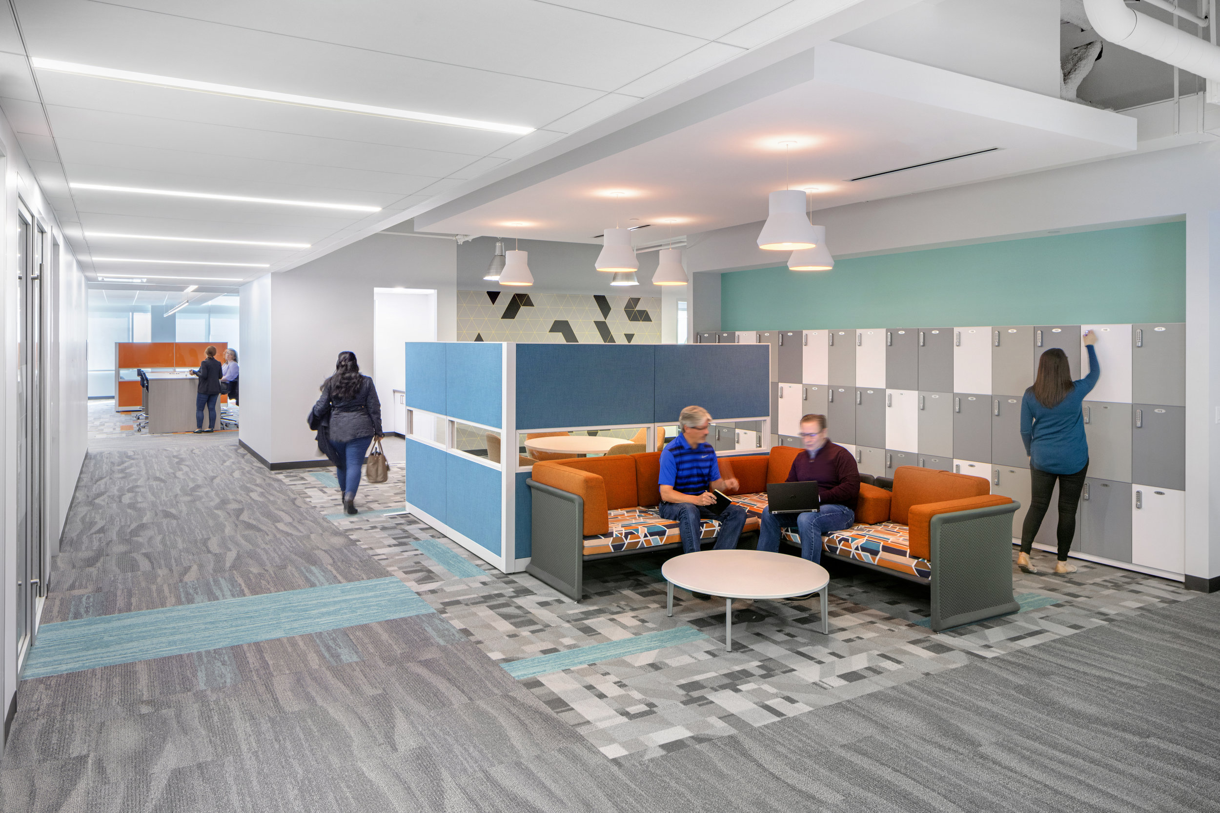
The company's brand includes segmented photographs and artwork to signify a broken patient experience. Along with this is a pattern of structured triangles, which signify a sense of order. Knowing that the office environment should be a different experience than opening up the company's brochure, we took an abstract take on what the "monster" would look like, inspired from this pattern and segmenting. The result was an endless library of custom artwork, all which illustrate chaos coming to order, representing the patient's mind being able to focus on their path ahead.


