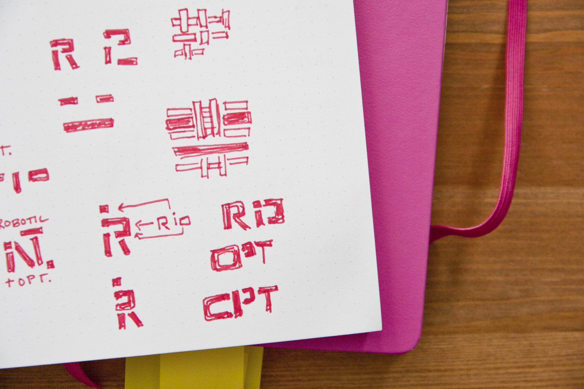
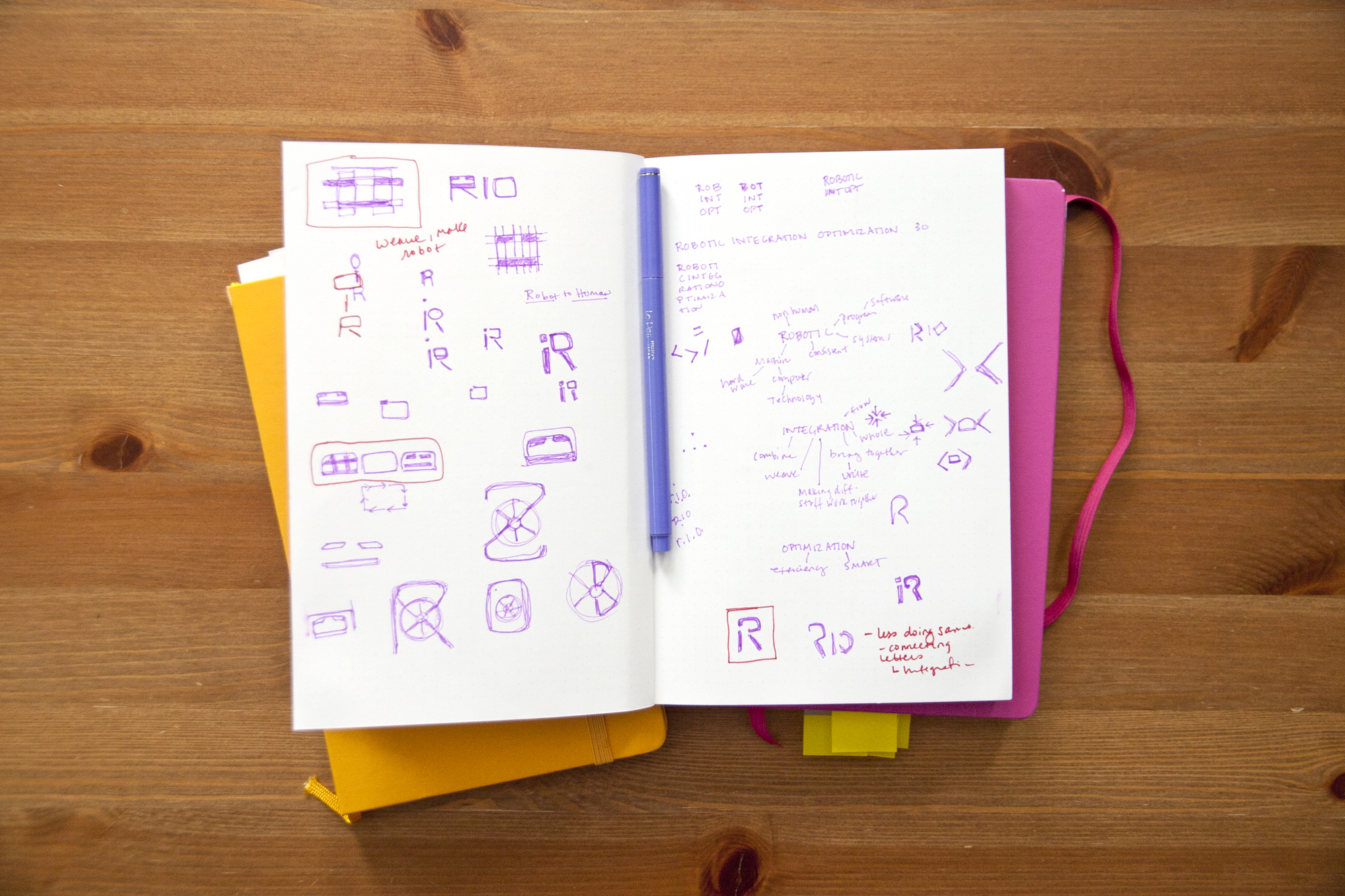
Because the team's responsibilities are so vast, it was difficult to compress the goals into a simple flat icon for swag. In the end, the major focus was simply the integration of the team. The weaving pattern allowed for this to be prominent, and also allows to show flexibility and growth in the future by expanding. The center negative space of the weave reveals a robot drive as the centric focus of the team. Another focus that was explored was the optimization of shapes to create acronyms. Ultimately, the team felt the weave represented them better, and the next step was to explore creating weaving icons for the three sub teams.


